LOD Cloud Quality Assessment
Results and Scripts for the Quality Assessment of the LOD Cloud
== Shortcuts ==
> Home
> Current Ranking
> Visualisation of Accessible Datasets
> Visualisation of Overall Data Quality
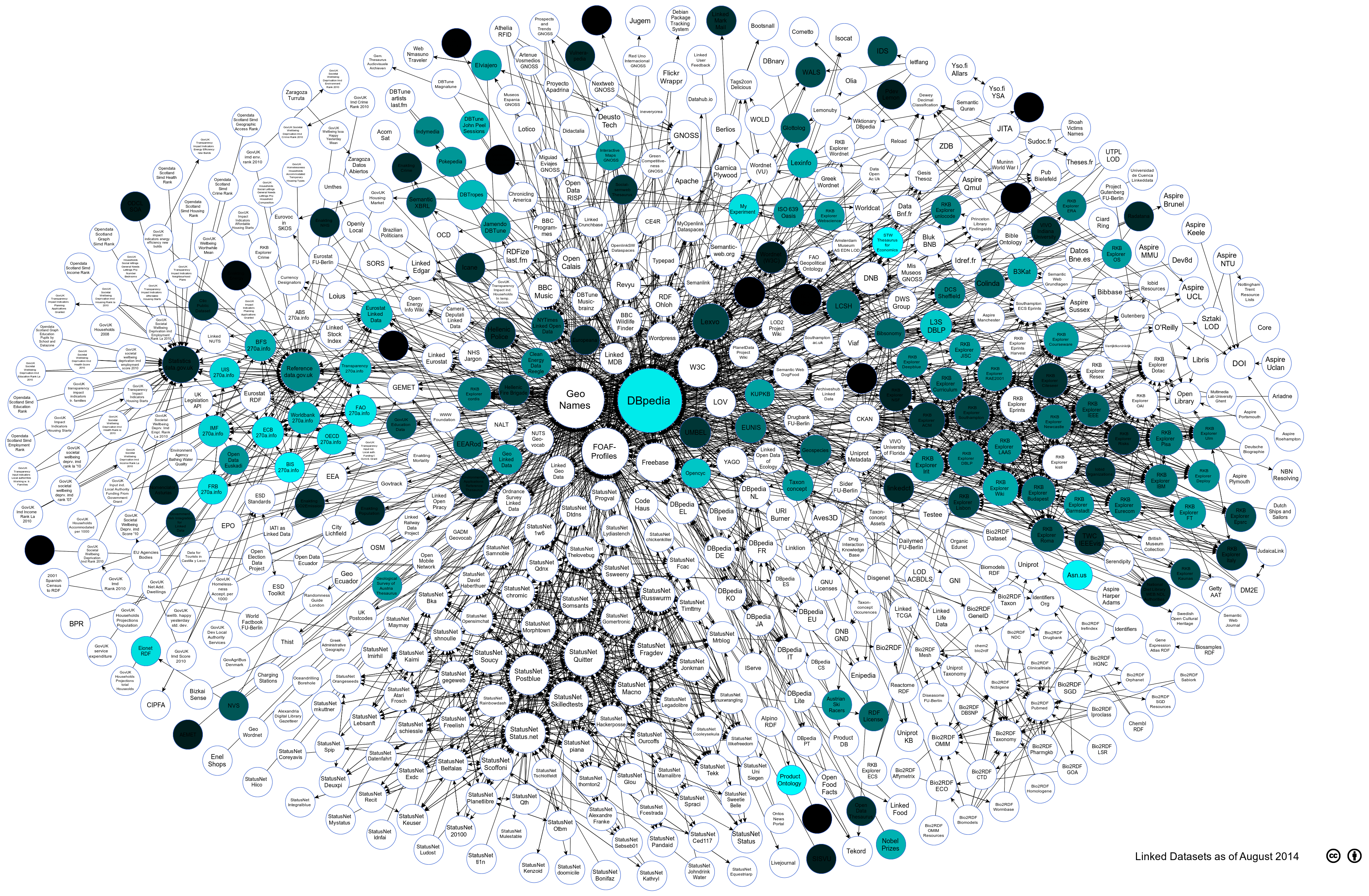
Visualising the Assessed LOD Cloud Datasets against the Accessiblity Category
The visualisation below shows how different datasets fare against each other against the Accessibility Category metrics. The darker the color of the circle means that it has lower conformance score. We can see that datasets like dbpedia has a high conformance amongst the other assessed datasets. The assessment identified that a large concentration of low quality values were mostly affected by licensing representation in the data itself.
Summary Statistics
- Average Conformance: 30%
- Standard Deviation: 19%
- Low usage of Machine-Readable Licences (17 out of 131 datasets) and Human-Readable Licences (11 out of 131 datasets)
Attribution
Linking Open Data cloud diagram 2014, by Max Schmachtenberg, Christian Bizer, Anja Jentzsch and Richard Cyganiak. http://lod-cloud.net/"
