LOD Cloud Quality Assessment
Results and Scripts for the Quality Assessment of the LOD Cloud
== Shortcuts ==
> Home
> Current Ranking
> Visualisation of Accessible Datasets
> Visualisation of Overall Data Quality
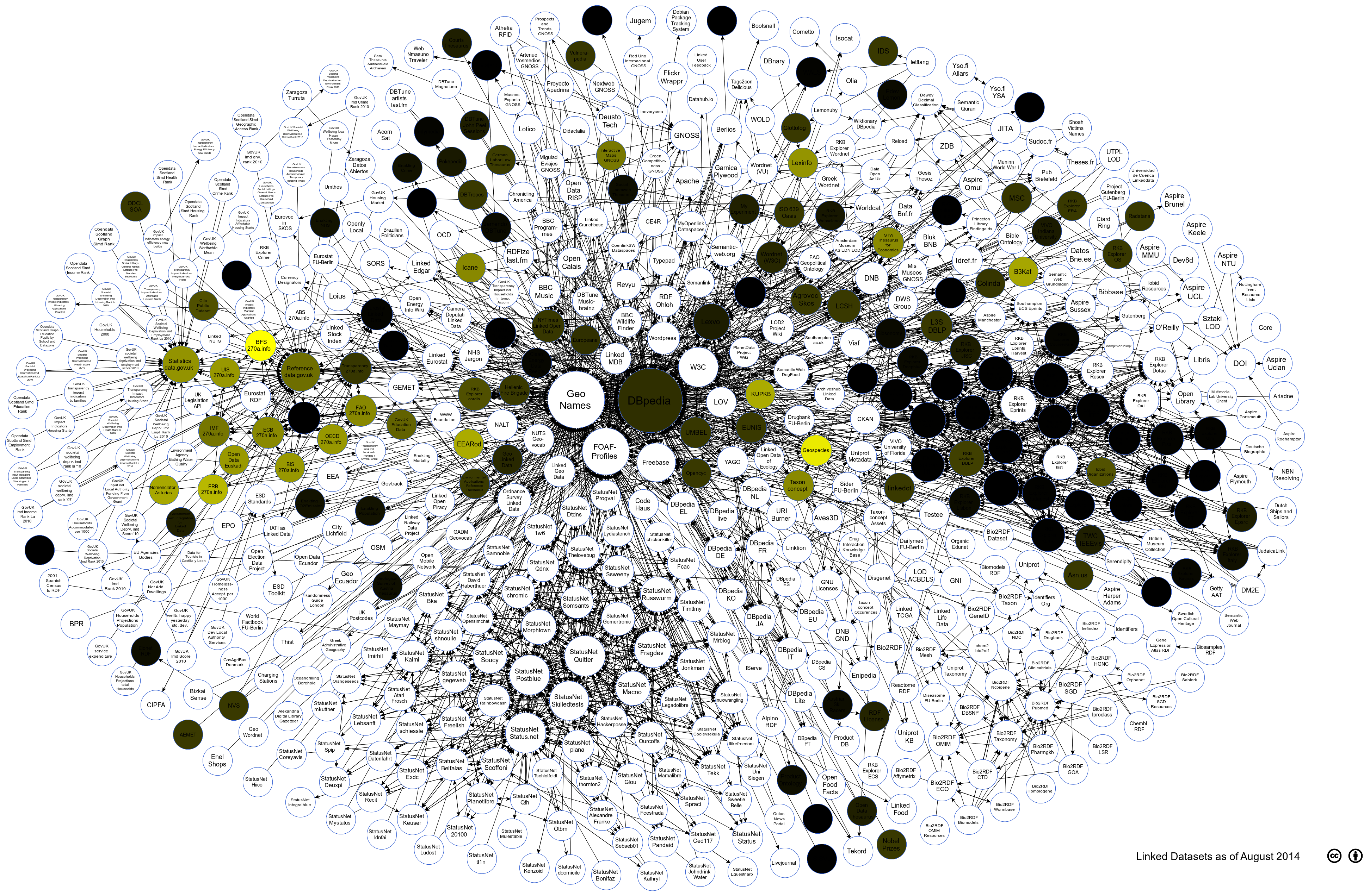
Visualising the Assessed LOD Cloud Datasets against the Contextual Category
The visualisation below shows how different datasets fare against each other against the Contextual Category metrics. The darker the color of the circle means that it has lower conformance score. For the contextual category we found an overall poor quality amongst the metrics, however, the most worrying is the fact that provenance information not given importance in the data itself. similar to other studies, we also found out that data publishers have to strive harder to ensure better human readable labelling and descriptions.
Summary Statistics
- Average Conformance: 13%
- Standard Deviation: 13%
- Poor conformance w.r.t. basic provenance information (e.g. creator of dataset), and traceability of data (predicates defining origin of data)
Attribution
Linking Open Data cloud diagram 2014, by Max Schmachtenberg, Christian Bizer, Anja Jentzsch and Richard Cyganiak. http://lod-cloud.net/"
